I’ll be discussing the reason behind designer brands having their logo in black and white.
What do designer brands have their logo in black and white for?
Designer brands have their logo in black and white for a few different reasons:
- It creates a timeless effect that’s visually appealing
- The look becomes versatile
- It stands out color wise with a bold look
- The look becomes conservative and could be put in more ads
My thoughts
Here’s a strong example made in the effectiveness of a recognized logo regardless of color.
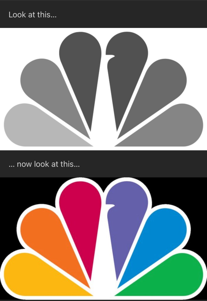
It makes sense in having an important structure over colors being needed to be remembered.
Remembering a peacock in this sense is the defining theme over its colorful counterpart.
There’s print and media that only displays in black and white.
Color alone shouldn’t be the reason your brand looks mediocre.
If we’re being honest here the look works with or without the color and could be recreated in many different ways.
Maybe I’ll draw up one to share.
But versatility could easily be used with this type of logo.
Of course we’re discussing designer brands so it could be applied to another with let’s say Ralph Lauren.

They have a look that transfers over to plenty of different colors.
The other quality is that it stands out in a bold way.
It’s a strong desire to want a brand image that’s widely accepted.
With merchandise and things that compliment them.
It’s best to see them as secondary enhancers.
When applying the criteria for these brands it also has a look that transfers over well in black and white.
Most of the time it’s seen as a conservative look that gets positively reviewed critiques.

Leave a comment