I’ll be explaining why blue is such a popular color for designs and logos.
That’s the case because blue represents security with loyalty and professionalism. There’s plenty of natural things that proves this belief to be true. The water in creeks, skies without clouds. It’s even on the flag that I represent. You’ll have plenty to communicate with this chill image that this color displays.
Blue
Here’s why so many people like the color blue:
- It conveys trust
- Non-threatening
- The different shades
- It came from gender norms
- Sense of calmness
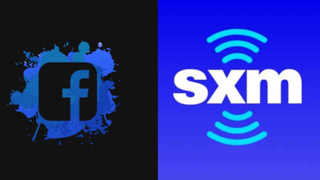
I picked the Facebook logo and Sirius XM because they’re probably my most used apps next to Disney Plus.
Related post
How important is a logo for a rapper
My thoughts
Blue isn’t the best to see in comparison to other colors but it’s still useful nonetheless.
It’s soft enough to see text but isn’t as prominent when compared to a red, yellow or green even.
There’s logos we could look at to even prove that the feeling certain colors convey with iconic logos don’t feel the same when it’s switched out with it’s opposite.
The blue color could be considered safe because the color can be owned by anybody confidently.
Unfortunately it’s not the same when compared to let’s say a purple or so.
For some reason purple doesn’t seem that appealing to men as an individual color.
There’s been successful stories on where the simple tweaking of adding more blue to a company can do things as impressive as increasing ad revenue greatly.
Even looking at Mark Zuckerberg that claims blue is the easiest on your eyes.
When you create the business and have a strong enough product you’ll be able to do things that go against tradition and still be successful.
Functionally speaking blue is one of the best colors to interact with when talking about technology as well.
Blue’s popularity can barely be matched.
End of story.

Leave a comment